Vlad Todirut
Product Designer

INTRO
Clarifying reward mechanics for a product that grew to $150M in Total Value Locked
Mezo is a blockchain product. It’s a Bitcoin Layer 2 built to make Bitcoin an actionable asset, not just a portfolio item.
To get things started - building early market interest and brand equity - we launched a points program to incentivize and reward early participants. People could deposit real Bitcoin and receive virtual points in return, which we called “mats.”
This was a pre-launch campaign, as the main product was in early development stage.
PREREQUISITE
Mats = points
Before getting into the problems, it's important we align on what mats are and why users might want them. Mats were the name we gave to the points users earned by using the Mezo platform. In web3, points usually hint that something else might come later (wink wink).
On the Mezo platform, users earned mats by depositing assets and locking them for a set time. The amount of mats gained depended on several factors:
the type of asset deposited
the amount deposited
the duration of the locked time
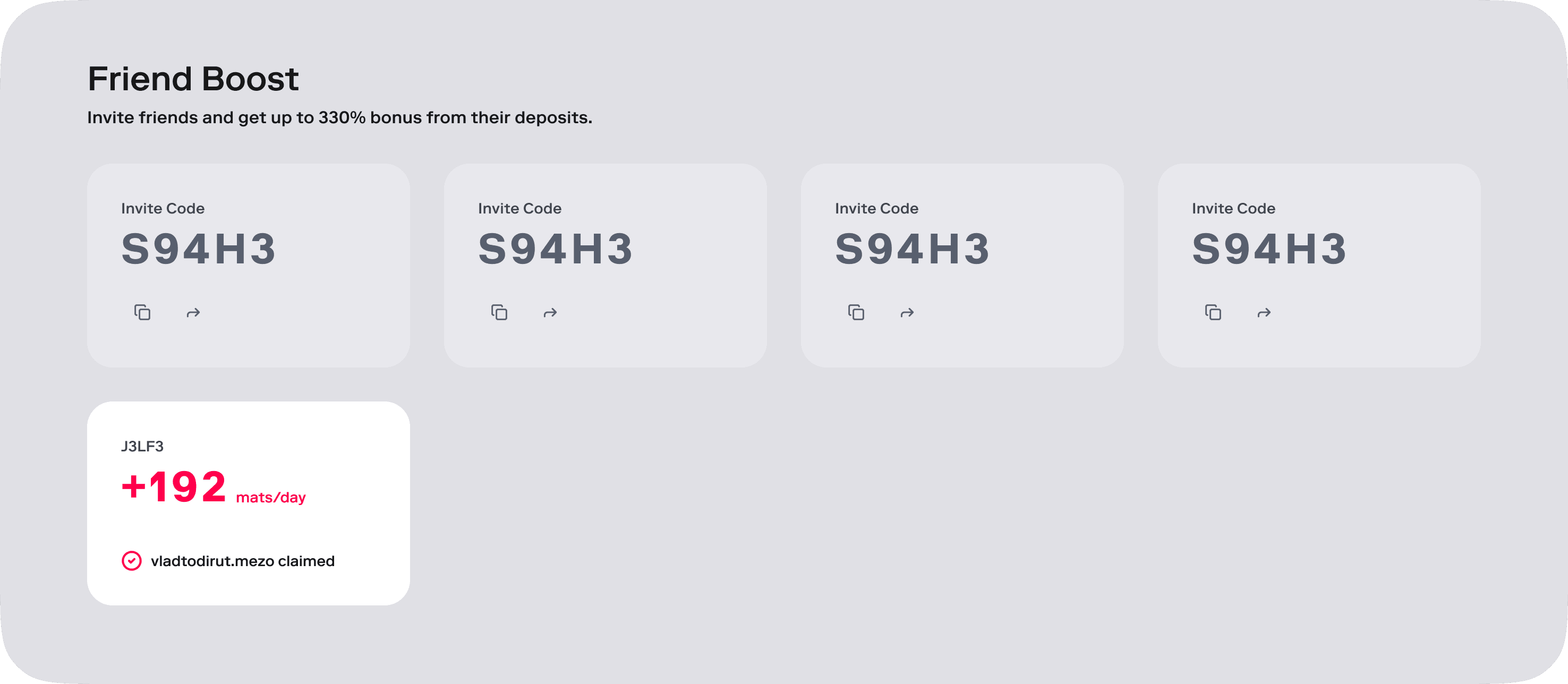
Additionally, users could earn more mats through our referral program - a share of the mats generated by people they invited would be added to their total mats.
PROBLEM(S)
IA & Design Language
Our Information Architecture needed a bit of work, we kept adding features without revisiting how it all comes together for a new user. I also made some assumptions to begin with that turned out to not be as accurate as we thought(more about that bellow).
The brand was also evolving, so I took this opportunity to update our product design language as well, aligning it better with our brand, this was an evolution and not a revolution.
TASK #1
Deposits
One key assumption I made was that our users would only make one deposit during the pre-launch campaign, maximum 2. An extra argument for this assumption was the minimum lock period for deposits(3 months) and users didn't have much they could do with those deposits.
This assumption led to my initial decision to not create a dedicated page for deposits for the launch version of Mezo. Instead, I positioned deposits on the same page as “My mats”, which became a control center for users to manage everything on Mezo.
My initial approach turned out to be wrong. Many of our users made multiple deposits, a behavior driven by the diversity of their portfolio. They deposited several different assets, targeting the mats rewards for each type of asset.
Placing deposits in the same page as “My mats” created several pain points:
for users: too much mental effort to distinguish and understand the data
for me: the constraints of the page made it unnecessarily complicated when wanting to expand the features later on
Solution
I went back to user research, this time better informed by the user behaviors I had already noticed, and ran a card sorting test. The results were more than conclusive (basically unanimous): deposits needed their own dedicated page.
TASK #2
Referrals
Despite our best efforts and writing a couple of blog posts, there were a lot of questions on our social and community platforms on how referral works and how somebody might get the full percentage bonus.
It wasn’t clear how your friends are connected to your mats, and how they influence your mats score or ranking. So this is something we needed to tackle. We added the secondary friends as a feature after the initial launch, and although we explored some options on how to add that information, we didn’t go back wide enough to understand how it affects the entire perception of the dashboard.
Before
This was a section in a bigger page called My mats.
Explorations
I started by experimenting with how to bring clarity to users, through signals and UI structure. I focused on finding a solution that covers all the user needs we identified, while not introducing any new sources of confusion or complexity. Below are just a few of the directions i considered.
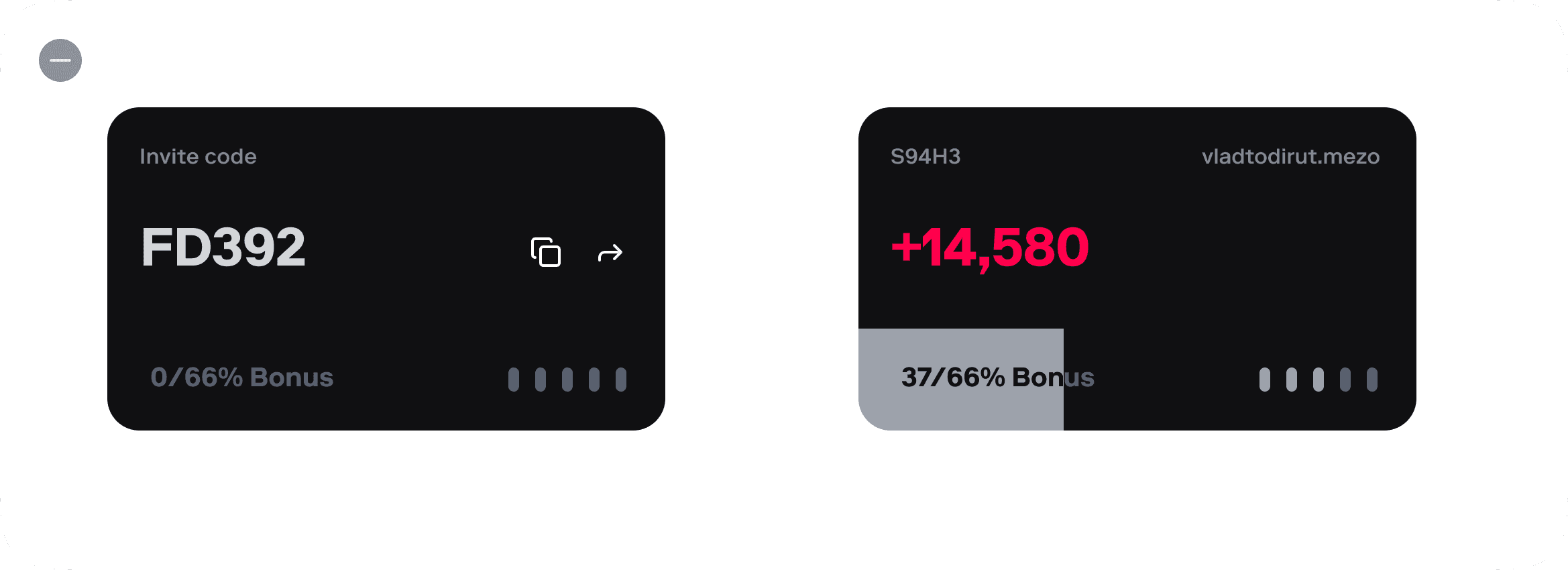
Exploration #1
This option kept the familiarity of our initial cards design but it failed to provide enough clarity. Some parts were more intuitive, but the overall visuals and the vertical dots seemed to introduce the extra confusion I wanted to avoid.
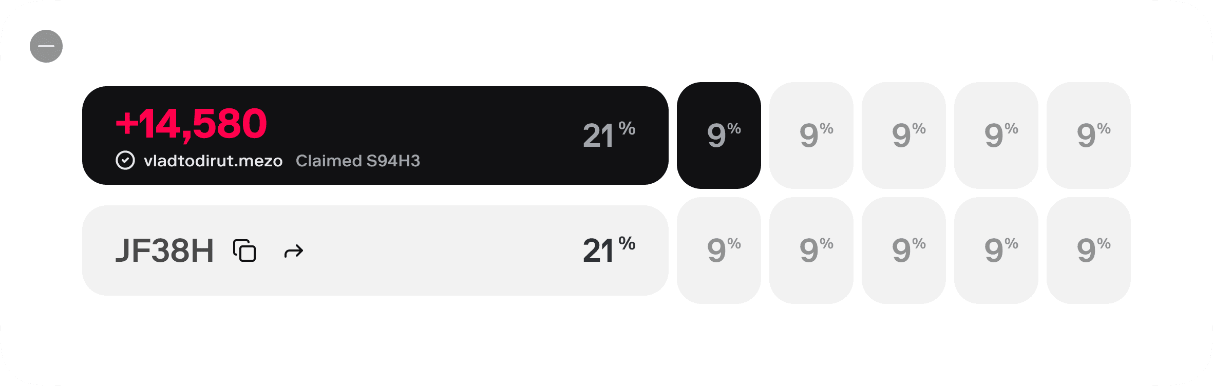
Exploration #2
This was one approach I tried to clarify the concept of secondary friends and what they contribute to your total mats. However, what it didn’t achieve was explaining the mechanics behind these friends, or provide enough clarity on what the 9& stood for.
Exploration #3
This is where an idea started to form, what if we split the screen in a main content section and a sidebar with actionable items. And this card would show how many you invited, what your current boost is and how far away you are from the goal. Also added an FAQ button for extra info.
This version had some of the clarity that i were looking for, without having too much weight in terms of information overload. Progressive disclosure was the way to go. Initially i considered this as an expandable menu, but that had some unwanted behaviour with elements moving on the screen.
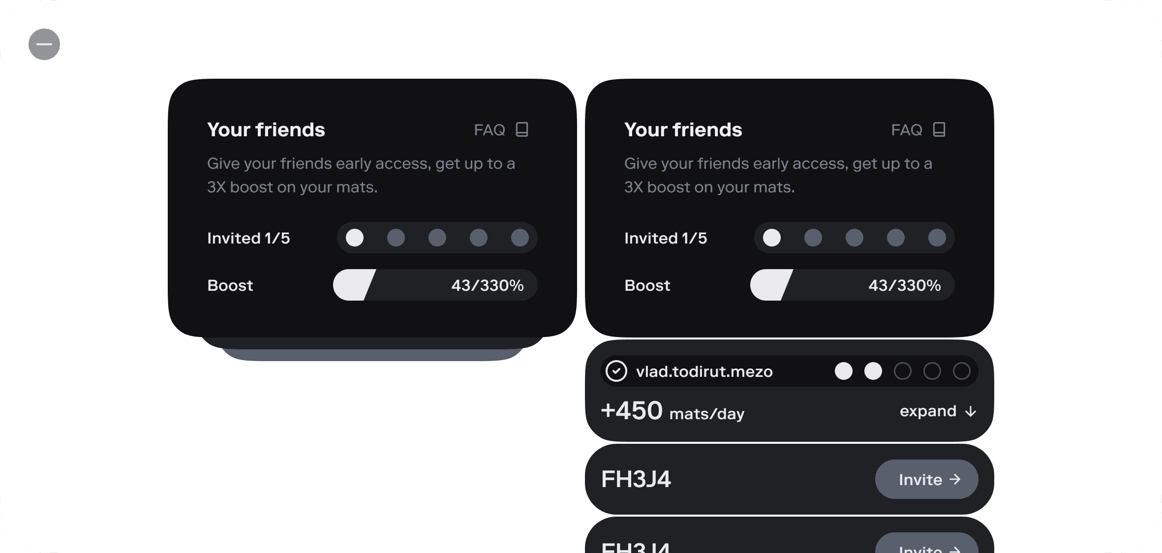
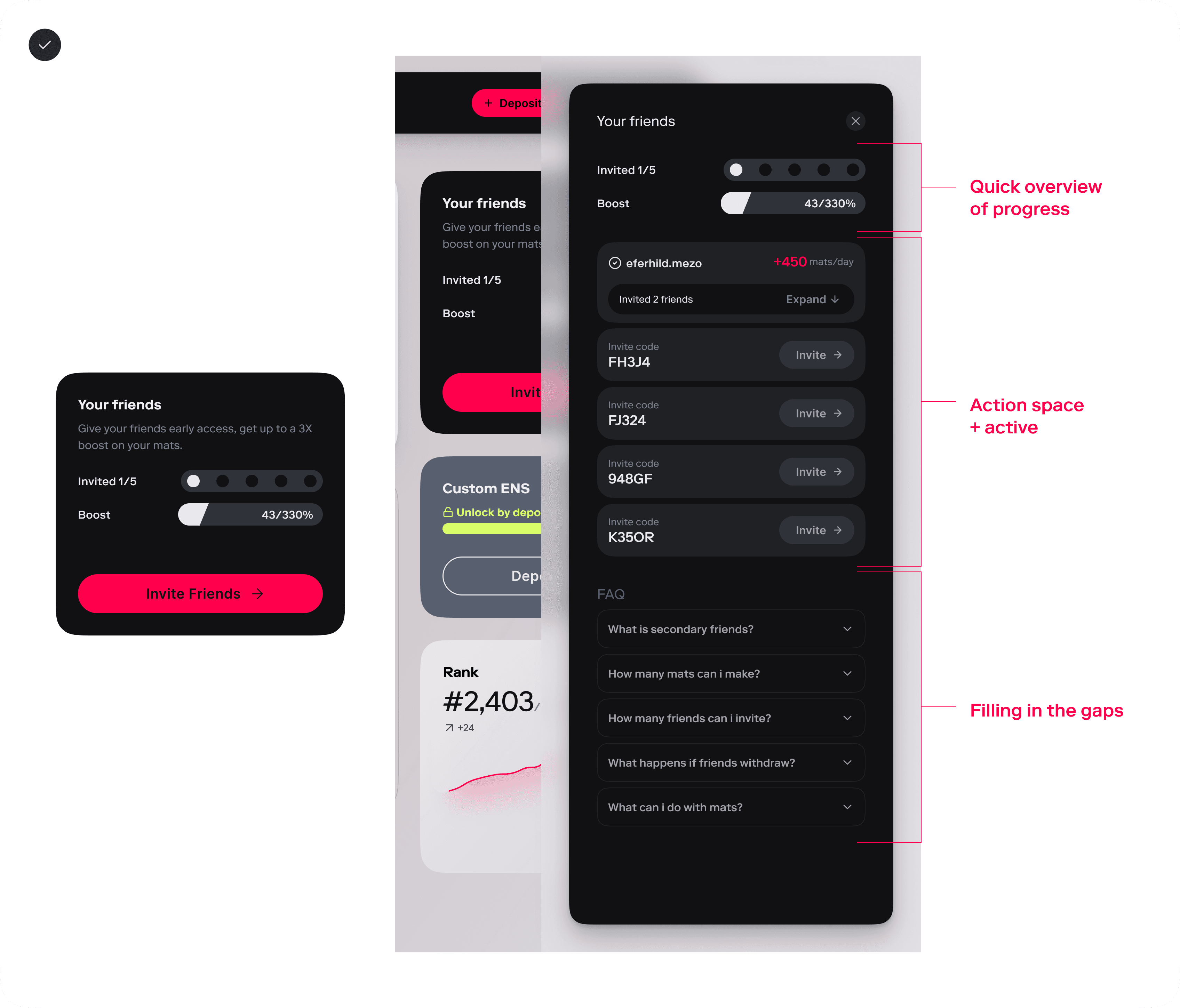
Final solution
Having found a solid direction in this later exploration, all I had to do was iron out the UX and information architecture around it.
I kept several parts of the design but chose to use a sidebar overlay which would be triggered by the “Friends” card. This decluttered the area and gave me enough flexibility to add some FAQ content directly on the page.
I also made a conscious choice to abstract away the focus on secondary friends and move it back to what users actually care about: their gains. “Secondary friends” was a product concept and mechanism, not a goal for the user.
At the end, I still had questions to clarify over time: should active and inactive cards be separated, what are the best language choices in our UX copy, is the FAQ section enough to tackle the common issues.
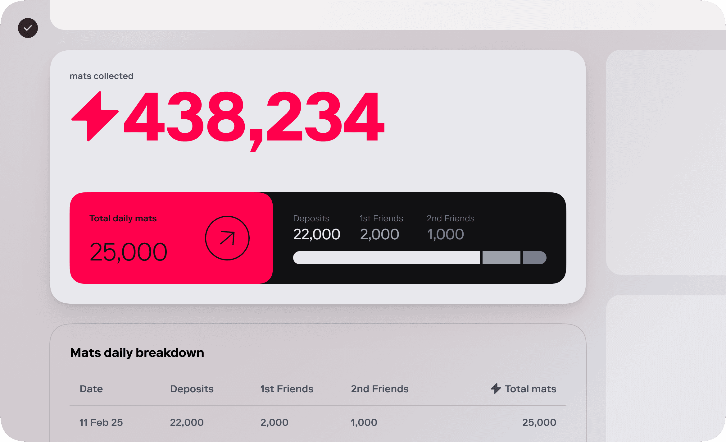
TASK #3
Total mats + Liveliness
While working on the referrals task, I continued to keep the full context of the page in mind. Part of that was making sure that anything we introduced on the page didn’t negatively impact its core goals: clarity about how mats are growing in your account and what you can do to increase that amount.
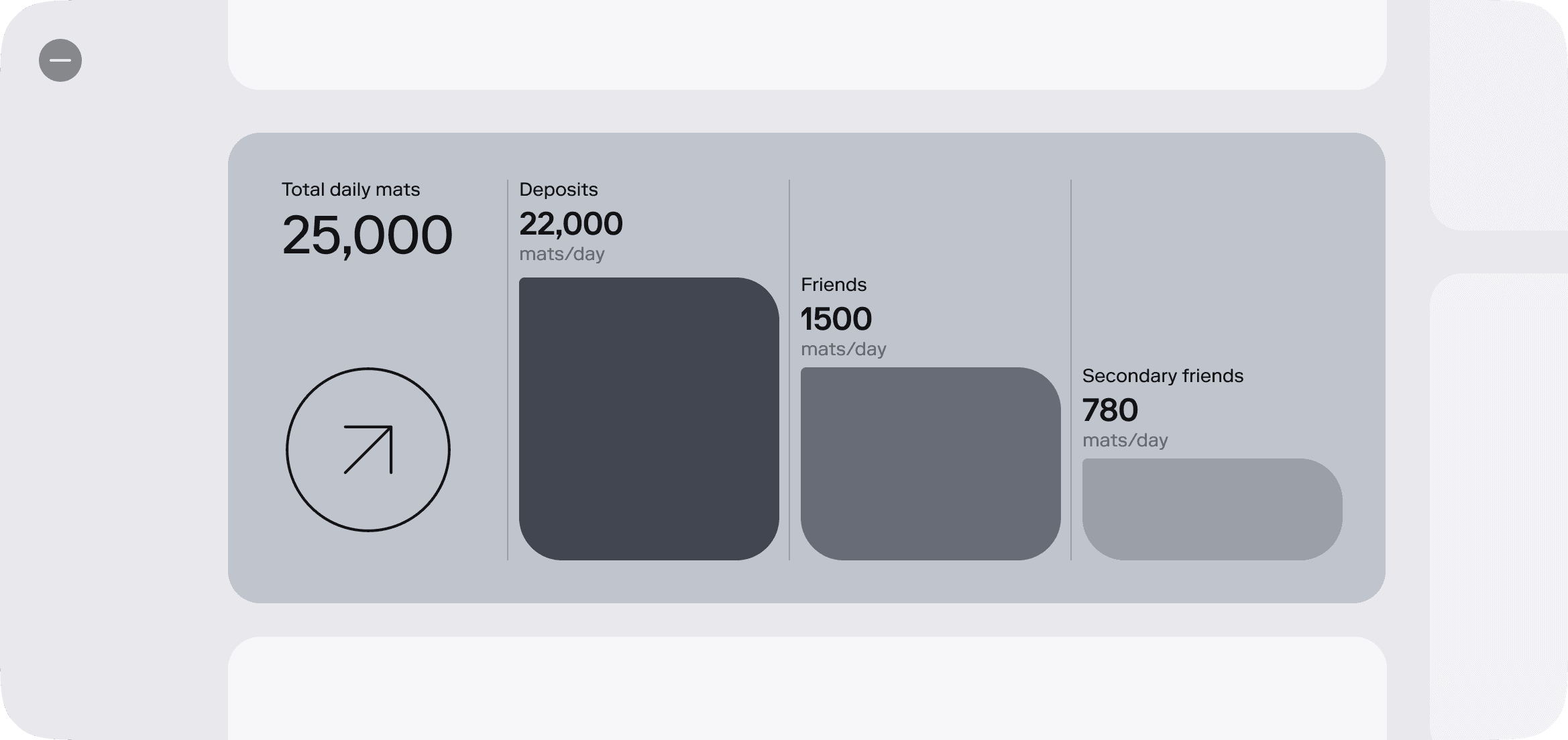
As part of the clarity bit I experimented with graphs and displaying more data regarding a user’s mats amount.
In the initial design, users could see how many mats they’re earning from their friends but not the total amount. We had also separated the amount of mats earned from deposits from the mats earned through referrals - making them look like completely distinct things which didn’t contribute to the same goal (total earned mats).
It put the responsibility to figure it out on the user and caused confusion.
I had the first half done already: breaking down mats data was a validated solution. The second part though, would turn out be quite a ride: how to translate that data into clear, accessible design.
Explorations
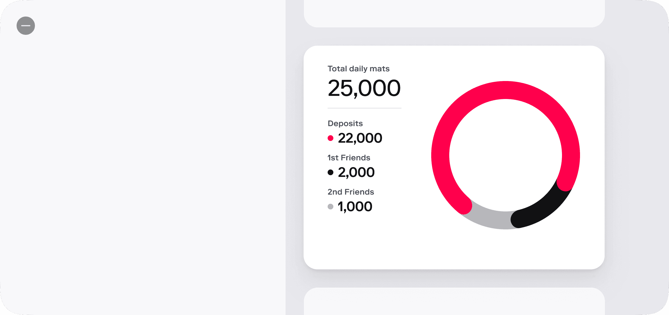
My focus was pretty clear: communicate 1 big number (the user’s mats) and the daily breakdown of that number. I initially considered also showing a breakdown of the total mats but that fell through quite quickly because of how challenging it would be to explain how mats accumulation changes over time (plenty of math involved).
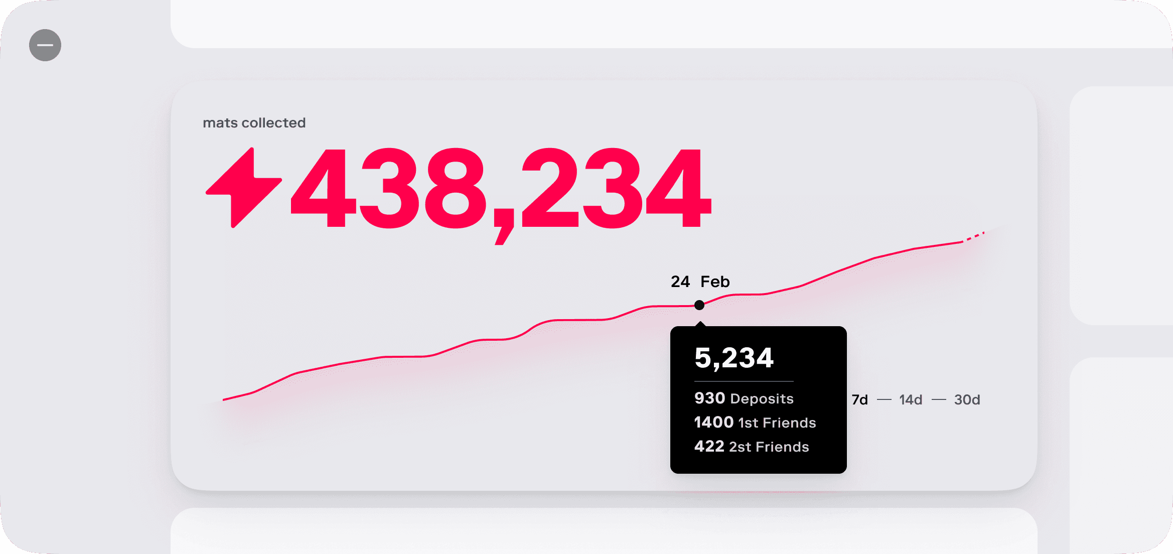
Exploration #1
This is one of the first attempts, out of many, at showing the daily mats breakdown. I ultimately scraped it because it was visually heavy and didn’t translate well in edge cases.
Exploration #2
Everybody likes a nice graph, right?
After simulating different scenarios and edge cases, I realized it would end up showing an unnatural straight-up line in a majority of cases, because the mats you earn daily doesn't change that often. This wasn’t only unhelpful for the user, it could also be perceived as an unreliable representation of data - and we definitely don’t want to lose trust.
Exploration #3
Experimented also with making this a side bar item, but the disconnect with the big my mats number was real, so i scratched it and chose to focus on keeping this in the main section of the website.
But i was close with the solution, i knew we needed something familiar, something that instantly made sense.
Final solution
I ultimately landed on a thoroughly tested path, using existing patterns and easily scannable content to bring users the clarity they need. It is innovative and sexy? No, but it doesn’t need to be. It needs to be clear and useful - and I fulfilled that goal.
The final design included the big “My mats” number, a clear breakdown of how you’re earning mats on a daily basis, and a simple history of how much you earned in previous days.
FINAL THOUGHTS
Learnings & changes
I came into this assuming i know the user base, by this time i already had 9 year experience with fintech/crypto crowd, so i was confident in my understanding of them. Bitcoin users turned out to have a couple of particular nuances that made me rethink my approach.
What i would do different if i had to go back, i would give more thought and time on experimenting with making My Friends it's own page as well, and not just one card on the my mats page.


